
The question
I am working on a site for a client which will feature a full screen background image. I was asked a very reasonable and totally valid question….what size should the images be in order to look their best on all devices, in both portrait and landscape orientations. Totally logical question, and kudos to the client for even taking the time to consider this point.
The client had determined the sizes of a few devices and requested that I confirm whether or not they would work for their site.
- Desktop: 1280px x 900 px
- iPhone: 450px x 671px
- iPad – portrait: 673 px x 1024 px
- iPad – landscape: 1024 px x 673 px
I wish my response was a simple confirmation of the dimensions that were proposed , but unfortunately it is not that straightforward. I could simply have responded by saying that the images should be 1600 x 900 or 1920 x 1080, but I fear that when the site is complete, there may be a significant gap between expectation and what is delivered. I absolutely HATE to disappoint people, so I always try to set expectations appropriately before I let anyone down. So, at the risk of providing waaaaaay too much information, I put together the following explanation in the hopes that a clearer understanding of how full-screen background images are handled by responsive themes would lead to an appropriate level of expectation.
The issues…
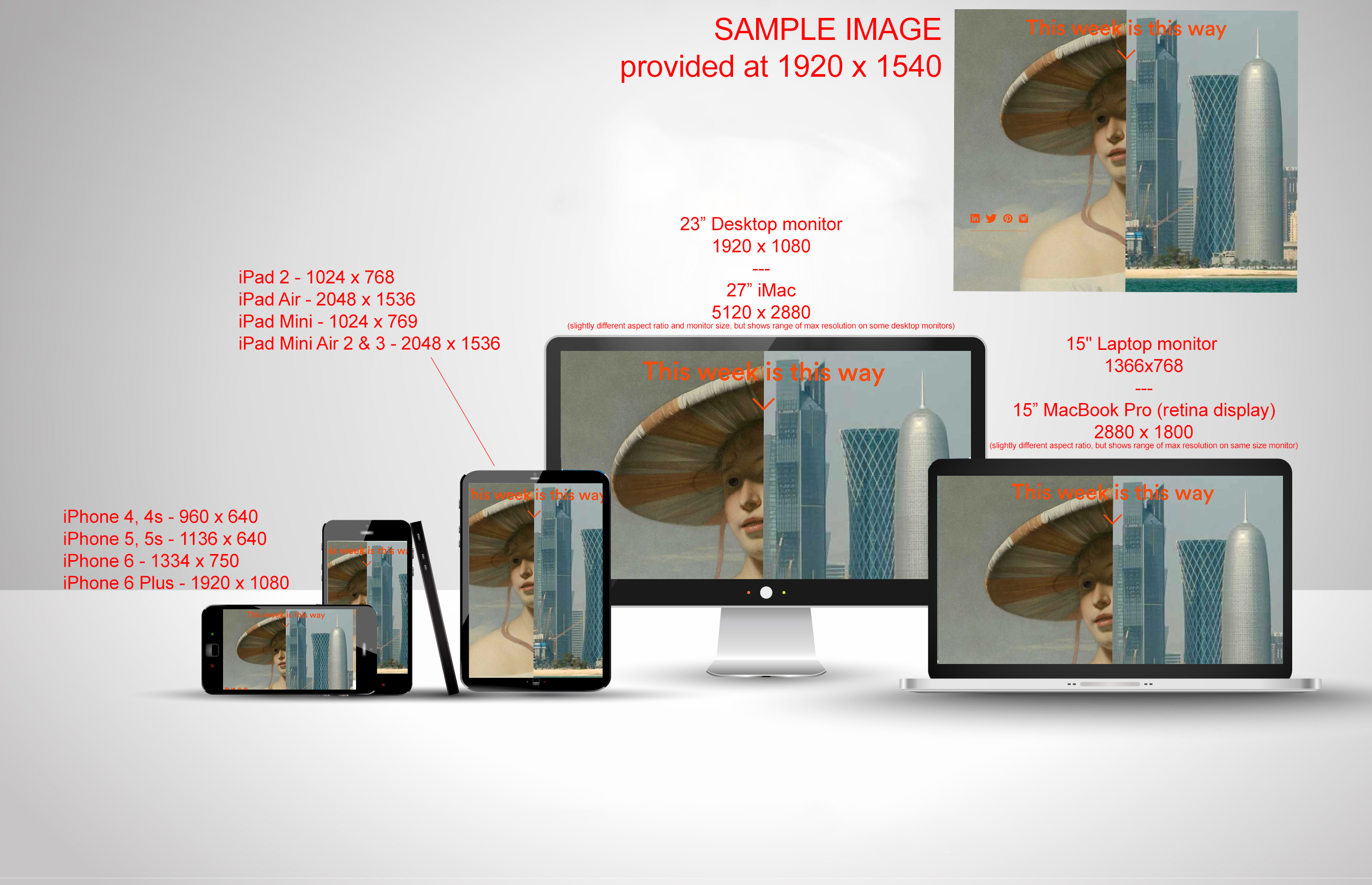
Unfortunately, the answer to the above question is complicated by the fact that there is no standard size or resolution for displays anymore. A 15″ HP laptop might have a max resolution of 1366 x 768, whilst my 15” MacBook Pro with retina display will go up to 2880 x 1800. My 23” desktop has a max resolution of 1920 x 1080, but a 27” iMac goes as high as 5120 x 2880. Further complicating things, users can reduce that resolution based upon they individual preferences (so, somebody with poor eyesight for example might have their resolution set to 800 x 600). Add in factors like iPads and iPhones which can rotate their displays from landscape to portrait, and have different screen resolutions for each successive generation (iPhone 4/4s vs iPhone 5/5s vs iPhone 6/6 plus, etc), not to mention the myriad of other tablet and smartphones on the market, and you wind up with an almost infinite number of display sizes.
This leads to a couple of key considerations when choosing the optimum image size…
- Aspect ratio…or, the ratio of width to height. If your image is (for example) 1280 x 960, the aspect ratio is stated as 4:3. If that image is viewed on any device with a 4:3 aspect ratio at full screen, it will look ok. If however, it is viewed on a monitor that is 1920x 1080 (16:9 aspect ratio), part of the image will get clipped off a little bit of the bottom, and viewers will have to scroll down to see the rest.
- Now, imagine looking at the same image in a portrait orientation on an iPhone 6, which is 750×1344 (aspect ratio of roughly 9:16). What happens is that the image will shrink to fill the height of the display and adjust the width accordingly, the end result of which is that the sides of the images will get significantly cropped. (see the attached illustration for a better example of how this might look).
- Or, on a Blackberry Z10 with an aspect ratio of 5:3
- My Macbook Pro’s aspect ratio is 8:5
- etc, etc, etc
- Display Resolution (image quality) – If we take the same sample image size of 1280 x 960 (4:3) and imagine that viewed at full-screen on my 23” desktop monitor with its 1920 x 1080 (16:9) display, not only will the bottom shoved off the screen, but the image will get stretched out width-wise and lose some quality and/or sharpness. This is always a tough call as the larger the image, the better the image looks, but it also means it will be a bigger file size and will take a little bit longer to load, especially over mobile connections. Ultimately this is always a compromise, but I would say that since the images really are a key focus of the site, it might be best to shoot for a slightly larger maximum width than 1200.
The bottom line thus far, is that whilst there is an ideal image size for every device, it is virtually impossible have a single ideal image size for all devices.
The end result here is that there will have to be a compromise that will try to cater to the majority of viewers/displays/devices. The biggest issue as I see it will be when the site is viewed in portrait orientation.
If you look at the attached illustration, you will see that I have used an image that the client sent me a couple of months ago, which is 1920×1540 (which is roughly 4:3.2 aspect ratio). The screen sizes in the illustration are approximate, but you will see that in the landscape orientation the bottom is cut off in every case. Speaking VERY generally (and largely owing to common video formats), most displays these days are closer to a 16:9 aspect ratio (landscape), so I would say that whatever size we decide upon, the aspect ratio should be as close to that as possible. As the illustration shows, when viewed in portrait orientation, this results in pretty significant cropping at the sides.
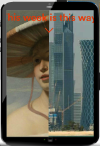
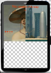
As a result, modern websites are responsive, meaning they will adjust their layout according to the size of the device/display being used to view it. How this works in practice is that the site is told to adjust the layout in some way if the display is less than a certain width. This manages to correct a lot of display quirks, but not all. In the case of full screen background images, the site will still try to fill the whole screen with the background image whilst preserving the aspect ratio, so when viewed in portrait mode (e.g. on an iPad with 3:4 aspect ratio), it has to choose between one of 4 options: cropping the sides, leaving a blank space at the bottom, stretching the image to fit, or repeating the background image….
cropping the sides
leaving a gap at the bottom

stretching the image
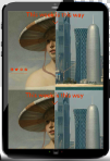
repeating the image
Tha solution
So when presented with the very reasonable question, ‘what is the correct image size for each format?’, in this case the answer really comes in 2 parts:
- aspect ratio is probably more important than size.
- by design, the image can only really be one size (or aspect ratio)….in other words we can’t have one background image for desktop monitors, another image for iPhone 4s users viewing the site in portrait orientation, another for iPhone 6 Plus users in landscape, and another for Blackberry users viewing the site in portrait orientation.
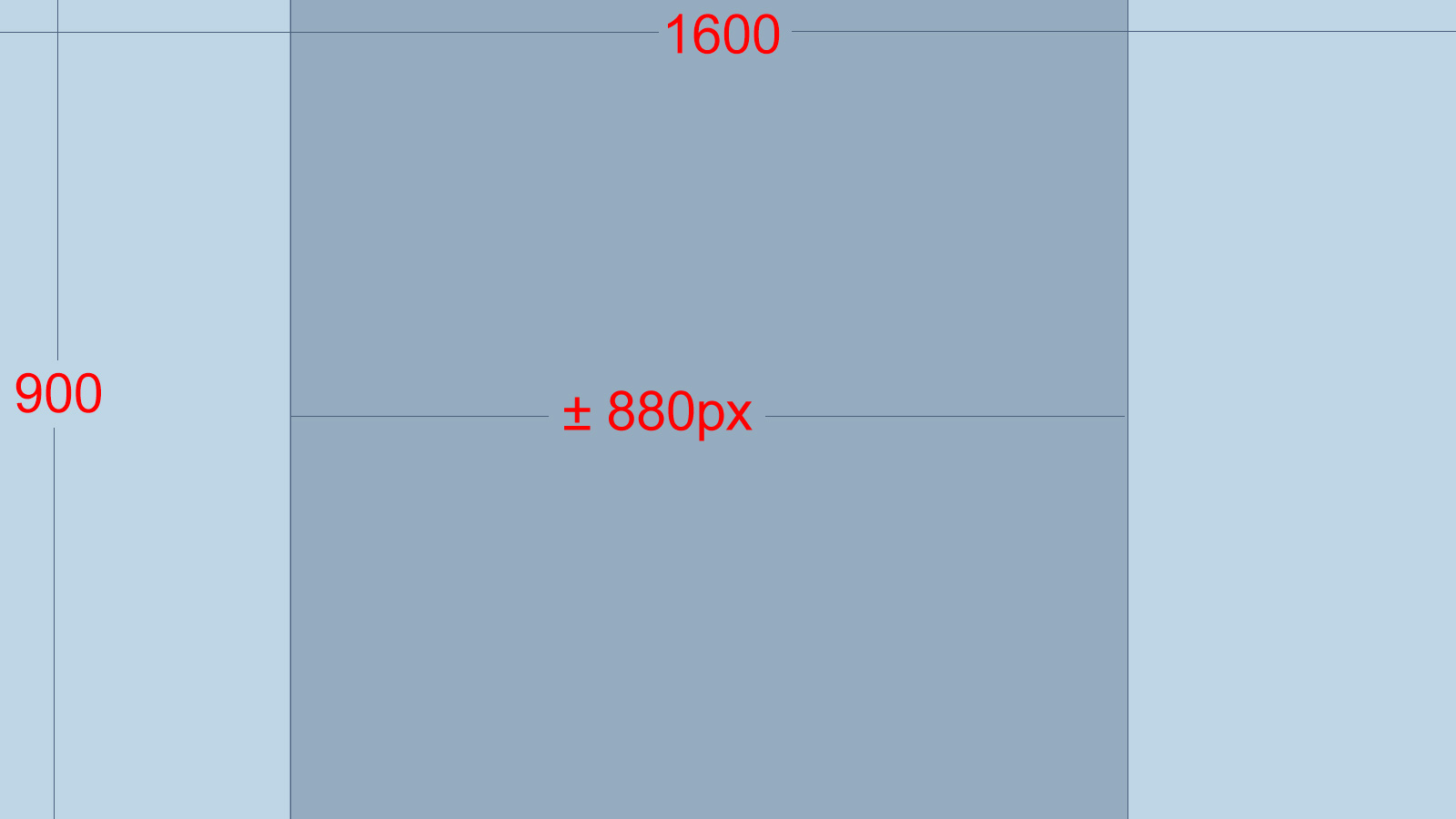
At the end of the day, I would say, shoot for either 1600 x 900 or (if you prefer higher quality images, but a slightly slower site) 1920 x 1080. The big caveat here is that when viewed in portrait orientation, we will lose more than 45% of the outer portion of the image, so I would recommend trying to compose images where the main subject is within the middle 55% of the overall width (see second attachment below). This may still result in a small portion of the image being cropped at the sides, but typically this is not going to have huge impact, especially on a background image.
I hope this helps more than it confuses, but please contact me if you have any additional questions regarding this or anything else.


